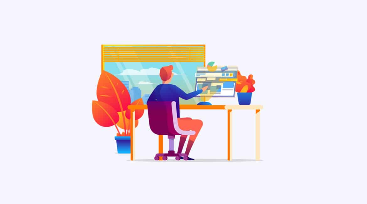
Internet access is already offered from a wide variety of devices, that’s no secret to anyone. Nor are we discovering anything new by saying that the user experience depends on the type of device being used. What must be said is that one of the most important things in this whole environment is design. The importance of web design services.
If the design of this is not able to adapt to the different screen sizes, it is very likely that the user who visits you for the first time will never return.
It is thinking about web design after the use that the person who is going to navigate it gives it. It should be borne in mind that with the large amount of competition and companies on the Internet, you have to find a way to make a difference.
For example: if you enter a page to buy a product, but the process that must be done to reach this end is eternal or complicated, the user will lose attention and will look for some other site that offers the same in a simpler way. It will also happen if the web design they chose does not provide security.
The cost of a poor decision on this issue can be great. Sales and future customers are lost. You may have the best quality products or services, but you couldn’t convey the same to you with your page. Therefore, when choosing between the types of web design, this point has to become your priority.
In this publication what we want to show is some of the types of web design that are in the market and that are vital. These are strategies that give a very different visual result, offer a different level of usability and accessibility, and have varying costs in their production and implementation. These are:
Adaptive, adaptive or adaptive web design:
This type of layout uses static templates for preset screen sizes, based on breakpoints, so that when a certain size limit is reached on the screen, the layout changes.
This technique offers a low level of usability because if the design changes, it is necessary to update all the templates. In addition, the contents can continue to be reduced if the access to the website is from a mobile phone.
Liquid or fluid web design:
Use relative measurements or percentages, instead of pixels, in this way the elements are adapted according to the width of the screen. This could cause images to be stretched on large screens, text to be difficult to read on small devices, or awkward side spaces to appear surrounding the entire page of the site.
This type of technique is the least effective and the least recommended.
Responsive web design or Responsive web design:
With this strategy, both the design and the content are adapted to each screen, providing a similar user experience in different formats or resolutions.
The contents are displayed in blocks that are reorganized according to the characteristics of the device and the browser in use. In other words, the information remains the same but the layout is optimized.
This is the most optimal and efficient web design technique.
It is important to mention that these methods are not necessarily exclusive, in some cases it is possible to apply them in combination. It should not be forgotten that the most important thing is that the focus of attention is on who is going to use the page. The customer needs conversions to take place. You must choose well between the types of web design and create a user friendly space.
This last point is essential if you want to make a useful web page design. Of course, the aesthetic part cannot be ignored either. After all, in these spaces, everything enters through the eyes.


